UI is essential to your customers use and purchase of your products and services. A consistent user interface testing makes sure that all the elements run smoothly. Incorporating quality assurance can help users trust you to figure out what their needs are and fulfill them. We are facing some issues in old UI interface. Low image quality, unclarity, incompatibility with mobile devices also remain typical interface bugs.
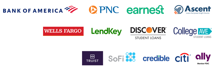
Competitors Analysis
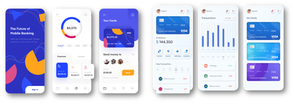
Common features they offer
Key takeaways:
Notifications in app
Data visualization: real-time, charts, graphics
Show cash back, rewards, and repayment opportunities
Set alert preferences
Scan & pay
Set your language preference
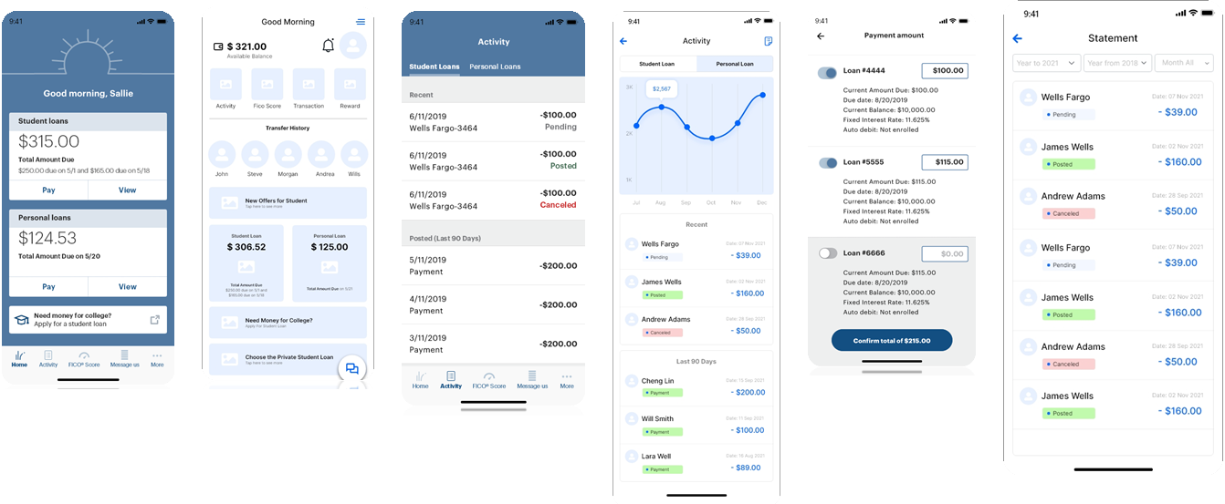
Current App Issues
Some of major issues
Improve chat capabilities: Users want enhancements and reliability with chat functionality. “Your chat feature didn’t work.” “Why do you have a chat support service that doesn’t populate? It would be helpful if it worked so I wouldn’t have to call in for simple fixes.”
Getting into app: Users want issues logging into the app resolved. “Constantly being logged out and told the app needs to be updated.” “The app always crashes with a ”something went wrong” message.“
Technical glitches: Users want to be reassured their payment is successful and data is secure. “App crashes after I submit payment every time. Leaves me uneasy if payment went through and question if app is secure.”
Payment education: Users want to be more informed about loan payment nuances. “More info on how to pay the principal. I keep paying extra but it’s only going toward the next payment.” “The app is a little confusing of knowing where to click to see how payment was applied to principal and interest.”
Show payoff amount: Users would like more transparency when it comes to paying off their loan(s). “Display the actual, true full-payoff amount.” “It would be nice that when someone is paying off a student loan that there could be an option to just pay it off.”
Current Trend’s
1. 2D or 3D graphics 2. Unique illustrations 3. Rounded organic shapes 4. Animated buttons and charts 5. Futuristic colors 6. Data visualization 7. Card and block views 8. Light shadows and smooth edges 9. Minimalistic icons 10. Serif fonts
What will We do to Improve the App
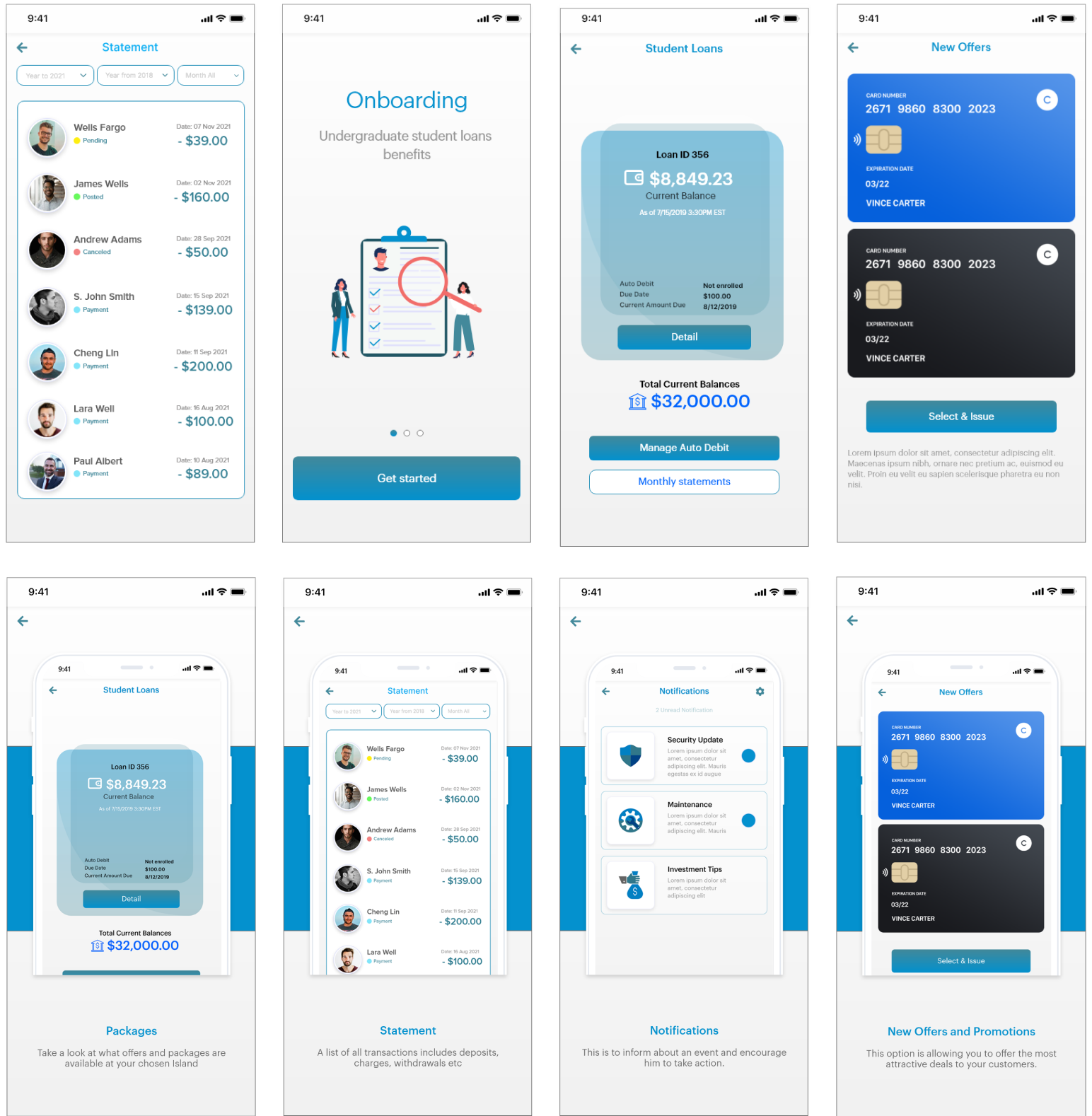
Screens that need to be improve
Existing
Improved
Existing
Improved
Existing
Improved
New Features we are adding in app
Advanced Account Insights
The Rise of Biometric Authentication
Focus on Cybersecurity / Alerts Update
Voice Command and Voice Recognition
Online Transactions Withdraw / ATM Connectivity
Live Chats / Live Support
Mobile Check Deposits
View and share Receipts
QR Code Payments
Intelligent AI Chatbots
Cash Back & Reward on Referral and transaction
Ecosystems and Marketplace Buy Online
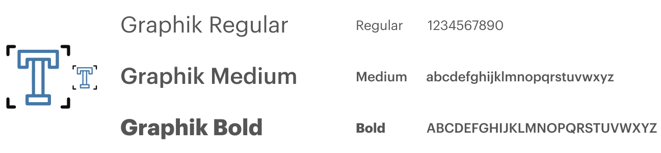
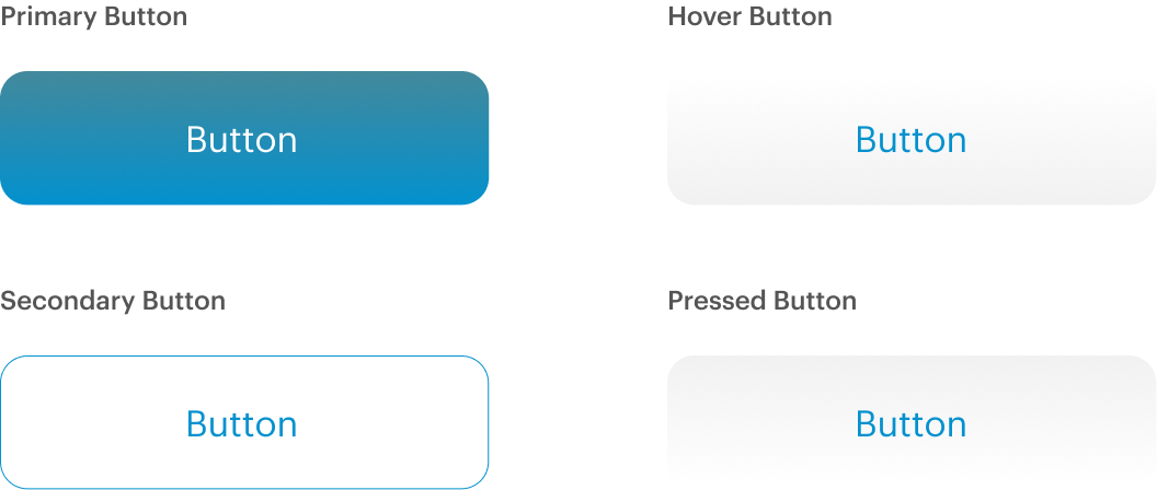
Typography and Colors
A great design system helps you design and build digital products a lot faster because they give you access to icons, typography rules, color palettes, and other design rules to follow during app or web development and the Fonts for apps play a major role in your users’ experience. We have used more advanced and trending font.
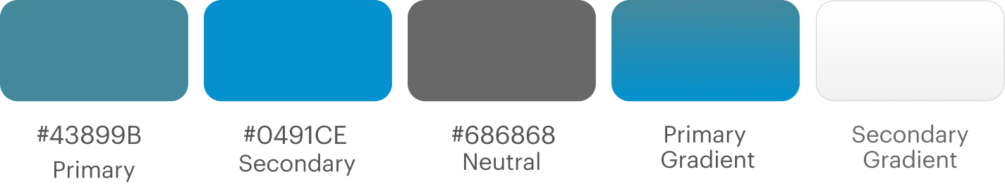
Modern Color Palette
Fonts for apps play a major role in your users’ experience. We have used more advanced and trending font.
Low fidelity mockups
A low-fidelity mockup is intentionally basic so you can focus on design and flow rather than intricate details. These designs can be created on just about anything—a napkin, graph paper, a whiteboard, or a digital, visual workspace.
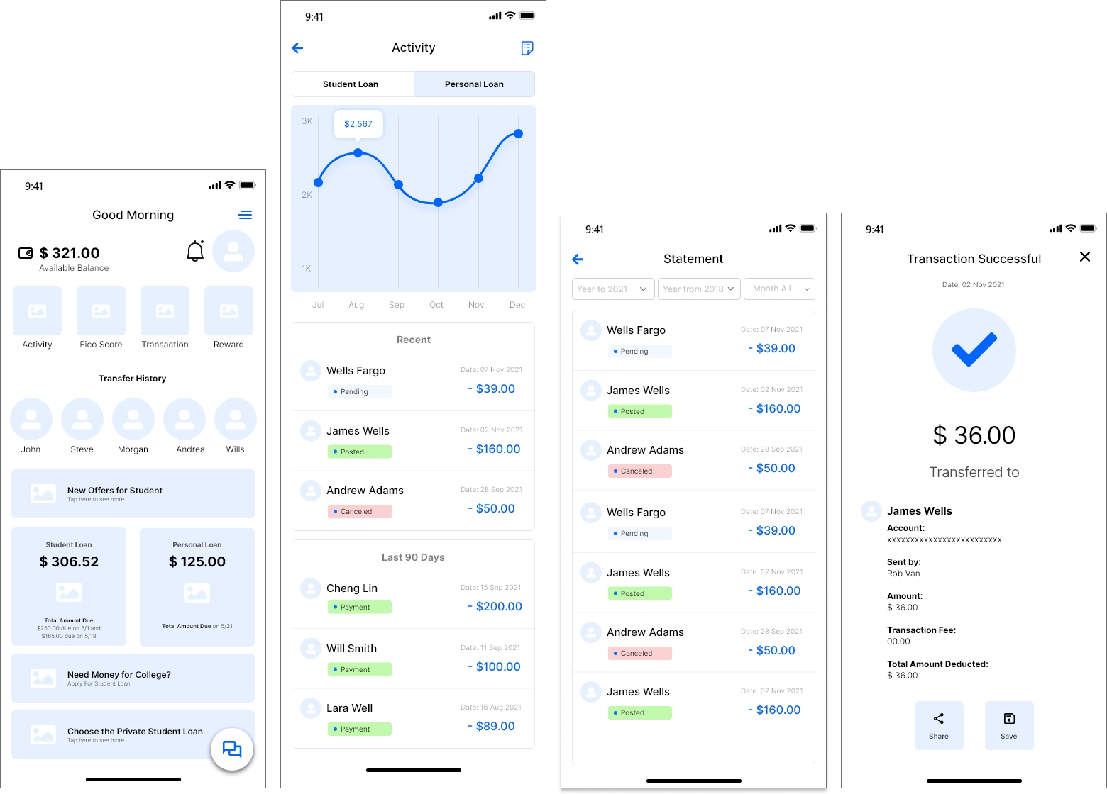
High fidelity mockups
A high fidelity wireframe captures the look and feel of the product in the advanced stages of the design process. Hi-fi wireframes go beyond the placeholders and ‘lorem ipsum’ text of low-fidelity wireframes to include actual content, typefaces, colors, image dimensions, and branding elements.