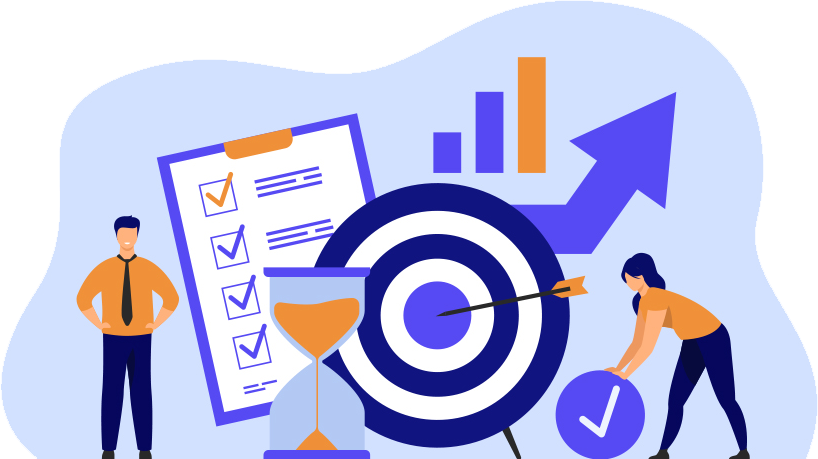
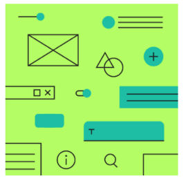
Understand and simplify UX research on behaviour of designers, who often spend long amounts of time searching for many different visual assets when working on one single project.
PRODUCT OVERVIEW & HIGHLIGHTS
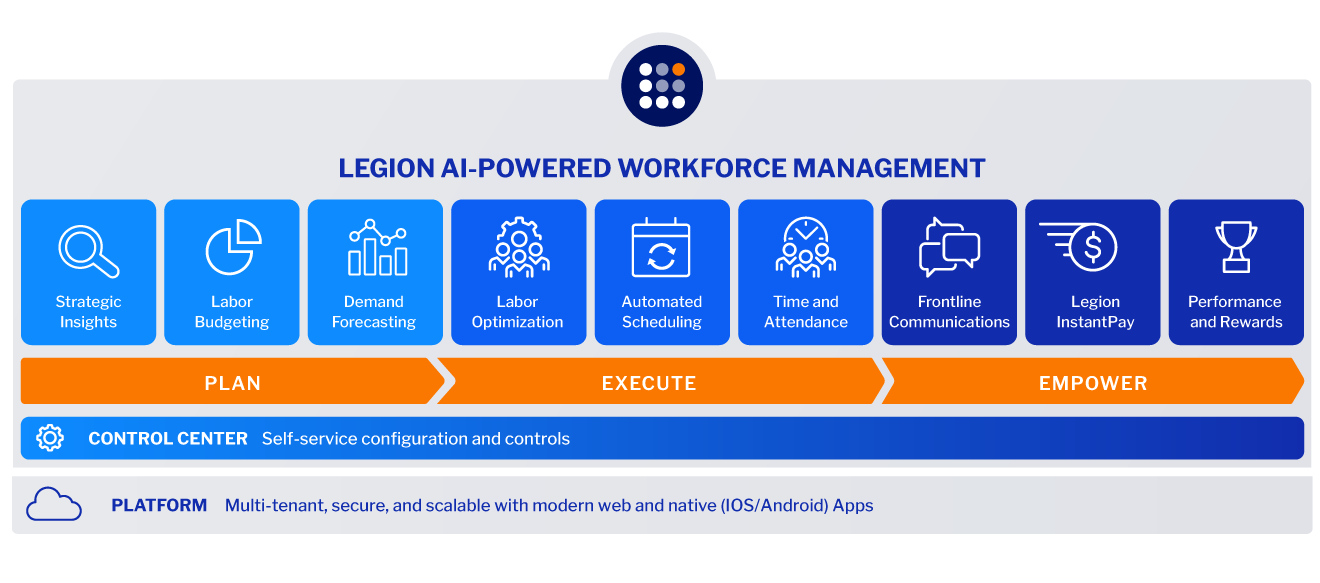
Optimize labor efficiency and enhance the employee experience simultaneously. Legion’s industry-leading, AI-powered WFM platform optimizes labor efficiency and employee experience simultaneously – at scale.
Attracting and retaining critical frontline hourly employees requires new thinking and modern solutions that achieve your business outcomes and enhance employee experience.
Our data-driven WFM approach produces highly accurate forecasts, schedule automation, and actionable insights so you can control labor costs, increase productivity, and minimize your compliance risk.
At the same time, Legion transforms the frontline employee experience – through schedule empowerment, early access to earned wages, and modern communications – so you can attract and retain employees.
As a result, businesses that use Legion WFM have achieved 13x ROI, cut scheduling time in half, and have over 95% employee adoption – ensuring a successful workforce management transformation.
13x ROI that’s been proven by Forrester Research based on Legion WFM customers
Proven AI that delivers optimized labor forecasts and perfect-match schedules
Fully automated granular demand forecasts at new levels of precision for greater labor efficiency
100% cloud-native with pre-built integrations and no upgrades costs
Modular approach enables you to augment or replace an existing WFM solution
95% employee adoption of the Legion app results in higher employee retention
Lightning-fast deployments at scale – 3-month go-live and fast time to value
ABOUT LEGION
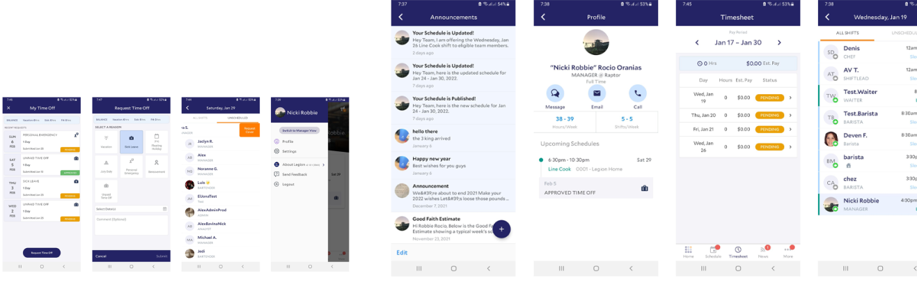
Legion is an AI-powered solution to manage hourly workforces. Businesses leverage it for self-service reporting, analytics, configuration to boost employee engagement. Its labor optimization and automated scheduling attributes minimize extra costs and inefficiencies.
It offers demand forecasting, time and attendance management, advanced analytics and more.
PRODUCT OVERVIEW & HIGHLIGHTS
Optimize labor efficiency and enhance the employee experience simultaneously. Legion’s industry-leading, AI-powered WFM platform optimizes labor efficiency and employee experience simultaneously – at scale.
Attracting and retaining critical frontline hourly employees requires new thinking and modern solutions that achieve your business outcomes and enhance employee experience.
Our data-driven WFM approach produces highly accurate forecasts, schedule automation, and actionable insights so you can control labor costs, increase productivity, and minimize your compliance risk.
At the same time, Legion transforms the frontline employee experience – through schedule empowerment, early access to earned wages, and modern communications – so you can attract and retain employees.
As a result, businesses that use Legion WFM have achieved 13x ROI, cut scheduling time in half, and have over 95% employee adoption – ensuring a successful workforce management transformation.
13x ROI that’s been proven by Forrester Research based on Legion WFM customers
Proven AI that delivers optimized labor forecasts and perfect-match schedules
Fully automated granular demand forecasts at new levels of precision for greater labor efficiency
100% cloud-native with pre-built integrations and no upgrades costs
Modular approach enables you to augment or replace an existing WFM solution
95% employee adoption of the Legion app results in higher employee retention
Lightning-fast deployments at scale – 3-month go-live and fast time to value
ABOUT LEGION
Legion is an AI-powered solution to manage hourly workforces. Businesses leverage it for self-service reporting, analytics, configuration to boost employee engagement. Its labor optimization and automated scheduling attributes minimize extra costs and inefficiencies.
It offers demand forecasting, time and attendance management, advanced analytics and more.
PROBLEM STATEMENT
Legion rapid product growth over the years was unstructured in terms of product design, i.e, lack of a design system. This led to severe user experience inconsistency across platforms.
Responsibilities We were part of a cross-functional team that had weekly meetings to sync about this initiative. And my duties varied from research, definition, UI design, Documentation…
Design Principal
Every discipline observes strict rules that generate stable and balanced work, be sure that design is no different. It will be weak and ineffective if it lacks that balance.. We constantly keep these core principles in mind when making design decisions at Saleforce, and we encourage you to adopt them es well.
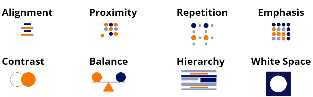
Alignment
Alignment is the principle of design used to create structure, organization, and improve readability. It helps create designs that are more visually pleasing to users, it helps them find what they are looking for. It helps the user better understand the connections between different elements.
Proximity
When elements are closed together, they are seen as grouped. The usage of proximity makes designers create content more comfortable to perceive by users. The pages are more scannable.
Proximity
When elements are closed together, they are seen as grouped. The usage of proximity makes designers create content more comfortable to perceive by users. The pages are more scannable.
Emphasis
Emphasis is to control how a user will experience your design by making elements stand out.
Contrast
Contrast helps us design better interfaces. It’s not only about light and dark color opposites or small and big sizes: it’s more than that. Contrast helps us organize our content in a better way, also it helps users to focus on certain elements. Aim at creating just the right amount of contrast by playing with:
Size * Color * Weight * Styles * Fonts * Fill
Balance
A balanced composition feels stable and pleasing to the eye while an unbalanced design can create instability and distraction. Visual balance is about having both negative and positive elements in equal proportions in the design.
Hierarchy
Is the arrangement of items in order of importance or weight on the screen. Visual hierarchy explains how we can organize content and design elements effectively. It’s natural that elements having more visual weight tend to catch users attention.
White Space
White space is the empty space in a design. It is also known as negative space, its purpose is to emphasize an object in a composition. Simply put, it creates focus.
kEY FINDINGS
Inconsistency As you can see, our product had many inconsistencies, be it in colors, components, guidelines…, which can have detrimental effects on the overall experience & the brand image.
Redundancy For designers, not having a library of components means you’ll have to do repetitive design work to create your product screens. This also applies to the implementation, since developers would have to spend more time and effort to create new components.
“We don’t have a clear theming for our semantic components (Errors, Warning, Confirmation…)” – Engineering Manager
“I can’t re-use a component from another project, since they don’t have a similar structure.” Omar — Front End Engineer
Rigidness For designers, not having a library of components means you’ll have to do repetitive design work to create your product screens. This also applies to the implementation, since developers would have to spend more time and effort to create new components.
2. Benchmark In the benchmarking, we deeply analyzed the documentation of the guidelines and the components of popular design systems.
Inconsistency As you can see, our product had many inconsistencies, be it in colors, components, guidelines…, which can have detrimental effects on the overall experience & the brand image.
Redundancy For designers, not having a library of components means you’ll have to do repetitive design work to create your product screens. This also applies to the implementation, since developers would have to spend more time and effort to create new components.
“We don’t have a clear theming for our semantic components (Errors, Warning, Confirmation…)” – Engineering Manager
“I can’t re-use a component from another project, since they don’t have a similar structure.” Omar — Front End Engineer
Rigidness In-existence of a buttons’ hierarchy nor a clear structure for the different states of the components used across platforms.
2. Benchmark In the benchmarking, we deeply analyzed the documentation of the guidelines and the components of popular design systems.
As an outcome of the benchmark, we found out that these popular design systems share some common principles. Based on our needs, we picked 3 principles as the pillars of our design system.
Accessibility : For a product that’s used by millions, we need to accommodate our different types of users, including the ones with visual, auditory, and motor impairments to create inclusive experiences.
Flexibility : The systems’ modularity ensures maximum flexibility in execution. Their components are designed to work seamlessly with each other and in whichever combination suits the needs of the user across platforms. Also, when it comes to color theming, Google Material has practically approached this through their *principles of color,* which is aligned with our long-term vision of verticalization.
Communication : Commonly, a design system should have a consistent structure in which textual elements and feedback messages are formed. More than that, it should have a library of illustrations that are user friendly to strengthen the brand’s feel within the product and help convey complex ideas in a simple way.
3. User Research Part of our company’s values is being user-centered. For that, we attended a weekly meeting to discuss and stay updated with the user feedbacks that come through different sources, e.g. NPS, reviews on app stores, customer service reports, Hotjar surveys, or yearly workshops (as you can see on the image).
Key Findings One of the most frequent user feedbacks we got is related to the UI. Users found the visual aspect of the products to be outdated.
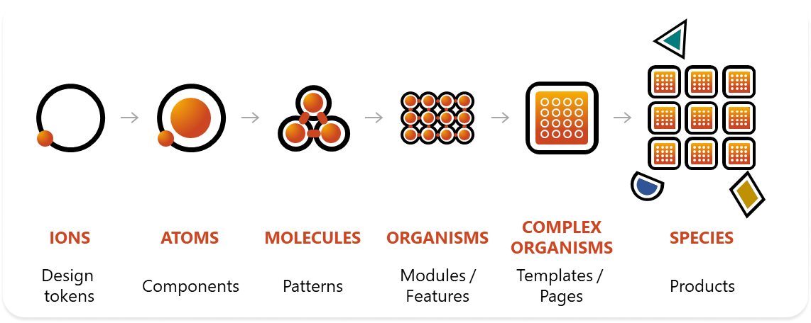
Definition To learn the proper approach for the definition of the structure and guidelines of our components, we set up a team of designers and engineers. Our high-level objective was to have a set of elements that could coherently co-exist within a larger system, which is why we adopted the Atomic Design methodology.
Atomic Design As Moroccans, we take huge pride in our traditional culture. Part of that is the famous style of tiles. Building a wall of traditional tiles starts with putting smaller and smaller pieces together. And this has inspired us to name our Design Language System Mosaic.
OUR WORK PROCESS
Building a website isn’t easy. There are many websites with good content, but the design is poor. Also, a site with good design lacks maintenance. Web development isn’t about implementing the codes on a website; web design also plays an essential role in the development process.
DESIGN SYSTEM
Design Language
Design Kit
Component Library
Developer Sandbox
Documentation Site
FACILITATES
Automated Workflows
Team Collaboration
Integrated Governance
Accelerated Innovation
Automated Workflows
Team Collaboration
Integrated Governance
Accelerated Innovation
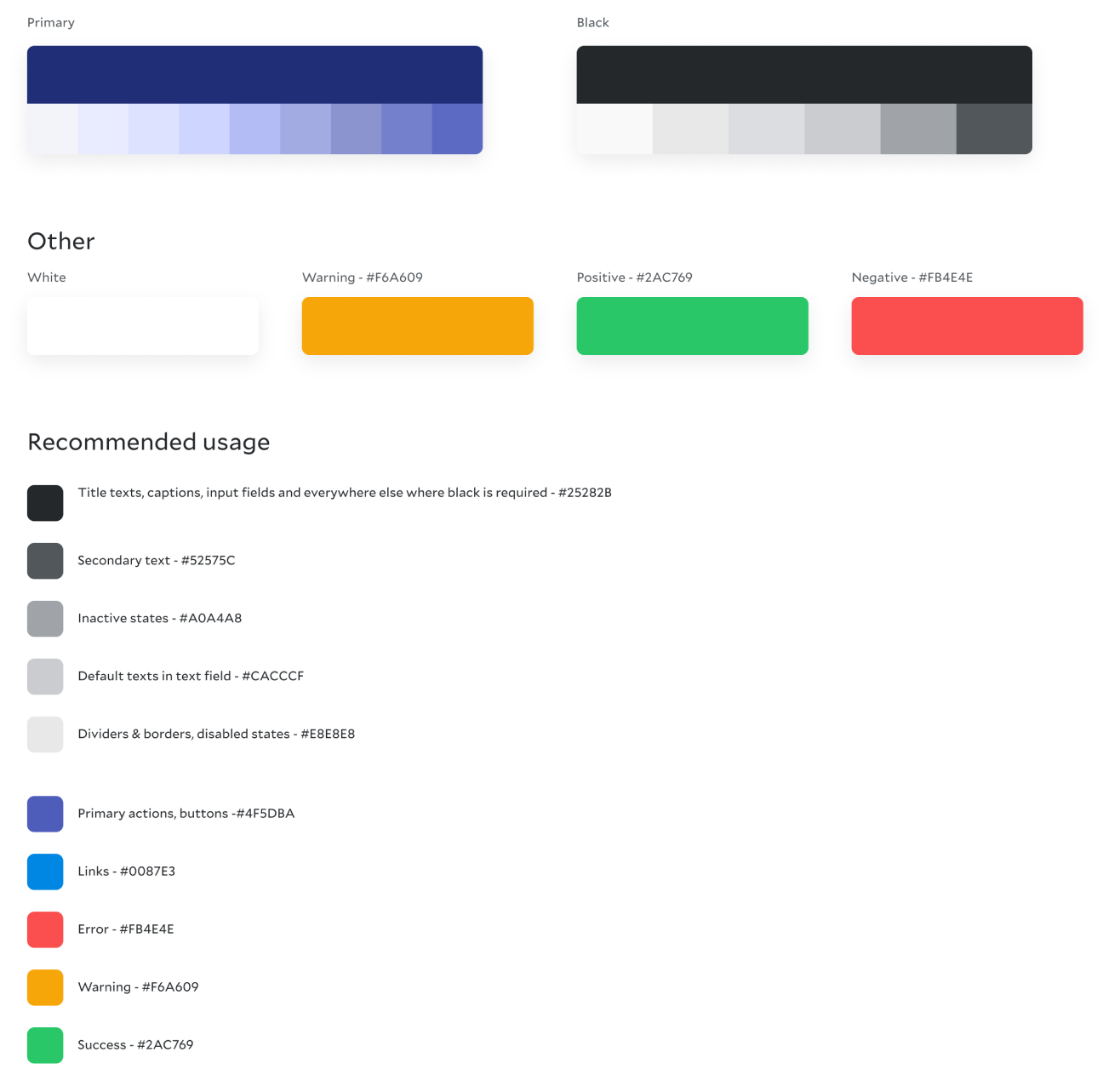
COLOR PALETTE
The Material Design color system helps you apply color to your UI in a meaningful way. In this system, you select a primary and a secondary color to represent your brand. Dark and light variants of each color can then be applied to your UI in different ways.
Colors and Theming
Color themes are designed to be harmonious, ensure accessible text, and distinguish UI elements and surfaces from one another.
A sample primary and secondary palette
1. Primary color 2. Secondary color 3. Light and dark variants
COLOR PRINCIPAL
Hierarchical
Color indicates which elements are interactive, how they relate to other elements, and their level of prominence. Important elements should stand out the most.
Legible
Text and important elements, like icons, should meet legibility standards when appearing on colored backgrounds.
Expressive
Show brand colors at memorable moments that reinforce your brand’s style.
COLORS That use in our design
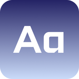
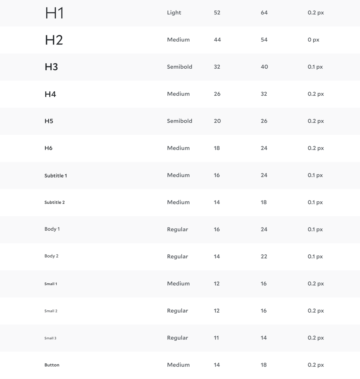
Fonts for apps play a major role in your users’ experience. Helvetica Neue has made a powerful emergence in many noted places from where it received vast acclaim. From using it on Logos to websites and Posters, you can make extended use of Helvetica Neue on every possible platform.
Type
Font Weight
Font Size
Line Height
Letter Spacing
GRID SYSTEM
Grid systems are aids designers use to build designs, arrange information and make consistent user experiences. They include rule of thirds, golden section, single-column, multi-column, modular, baseline and responsive grid systems. For example, responsive adapts content to screen size and orientation, for consistency.
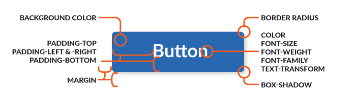
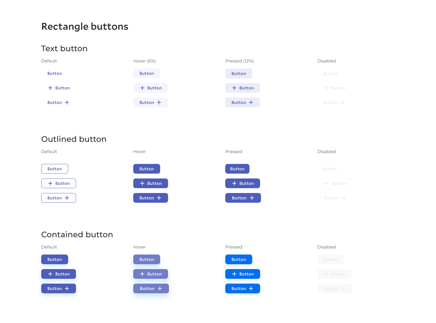
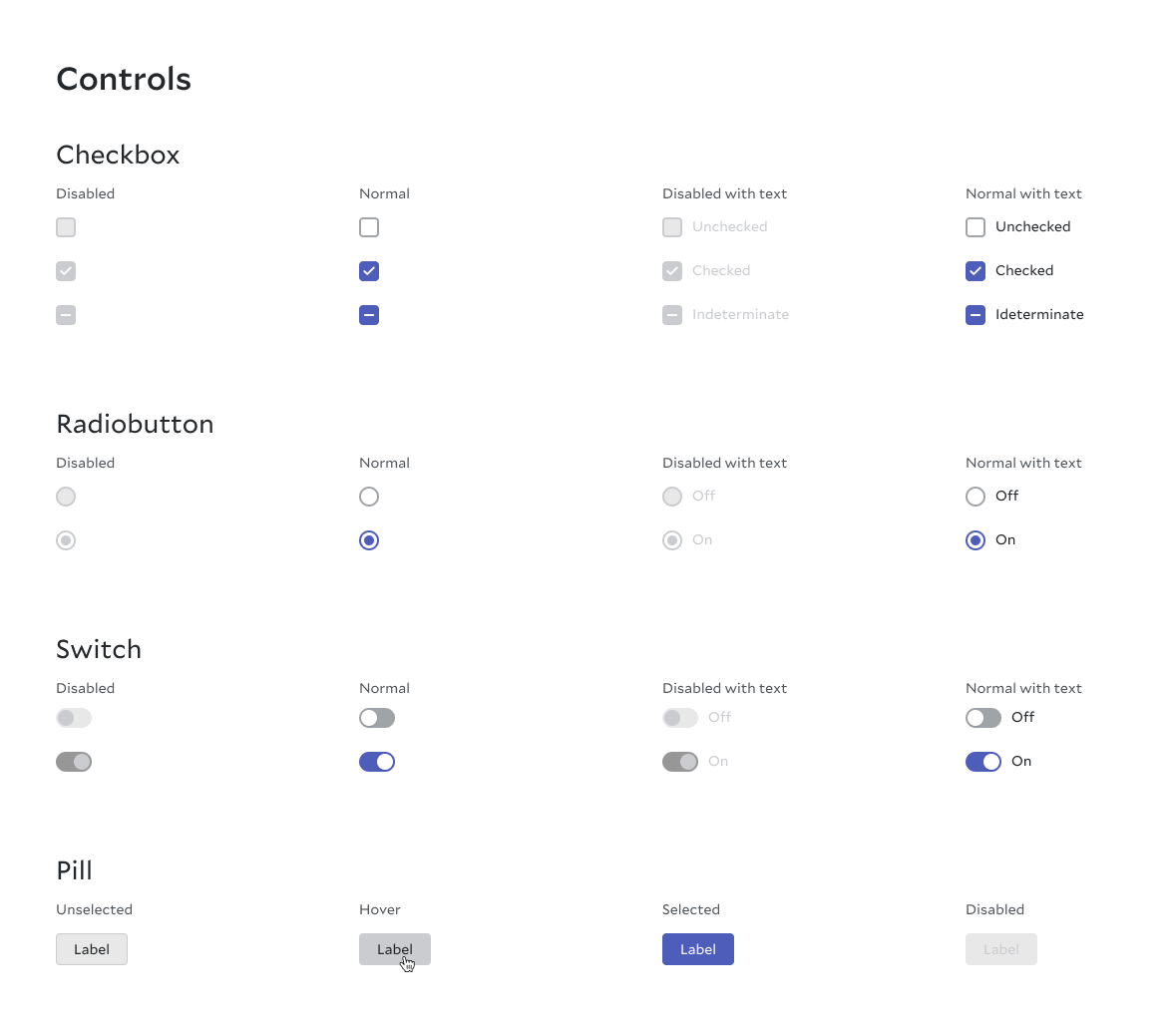
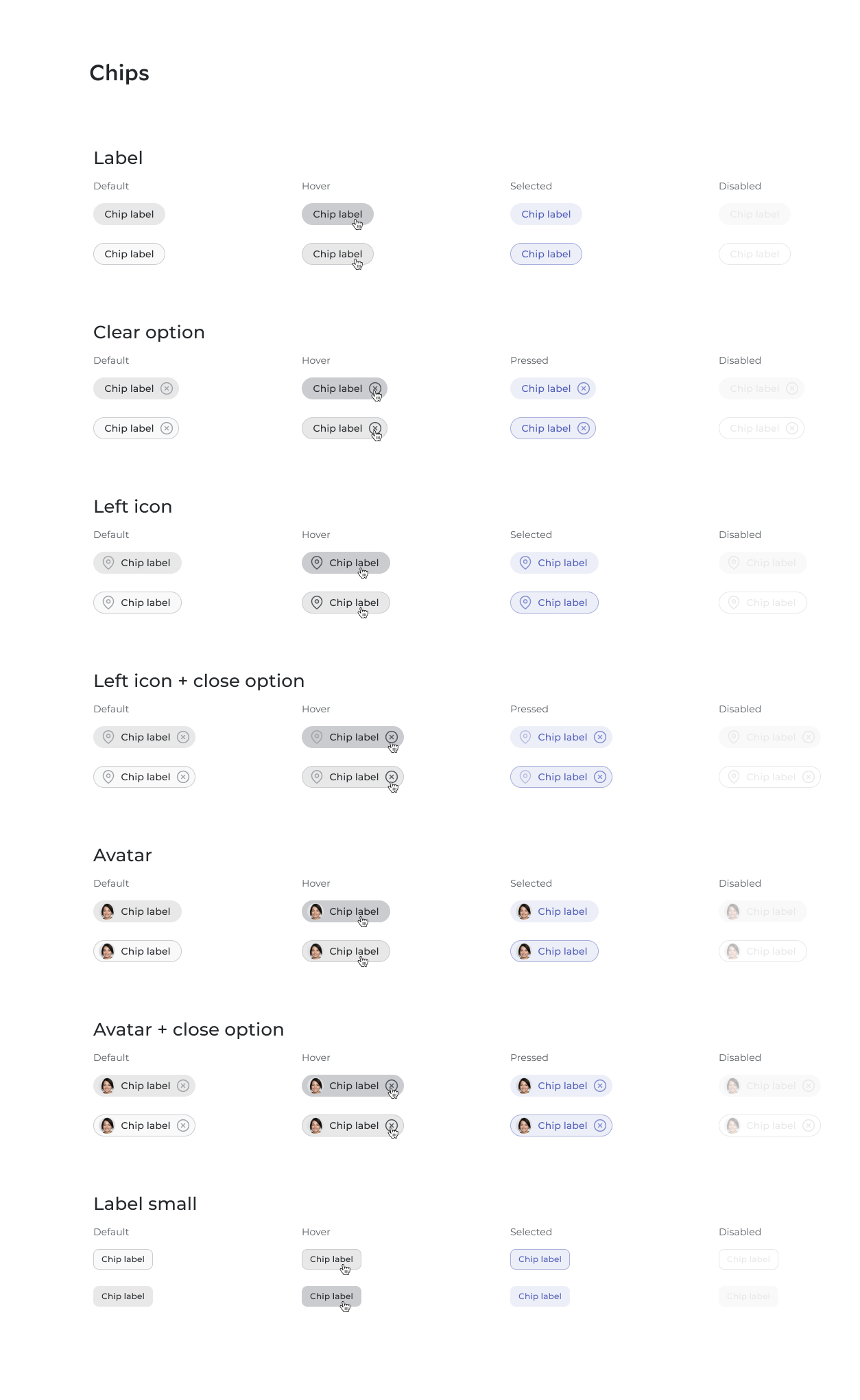
Buttons
Buttons allow users to take actions, and make choices, with a single tap. Buttons communicate actions that users can take. They are typically placed throughout your website UI, and they should be easily findable and identifiable while clearly indicating the action they allow a user to complete.
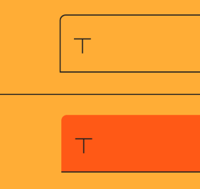
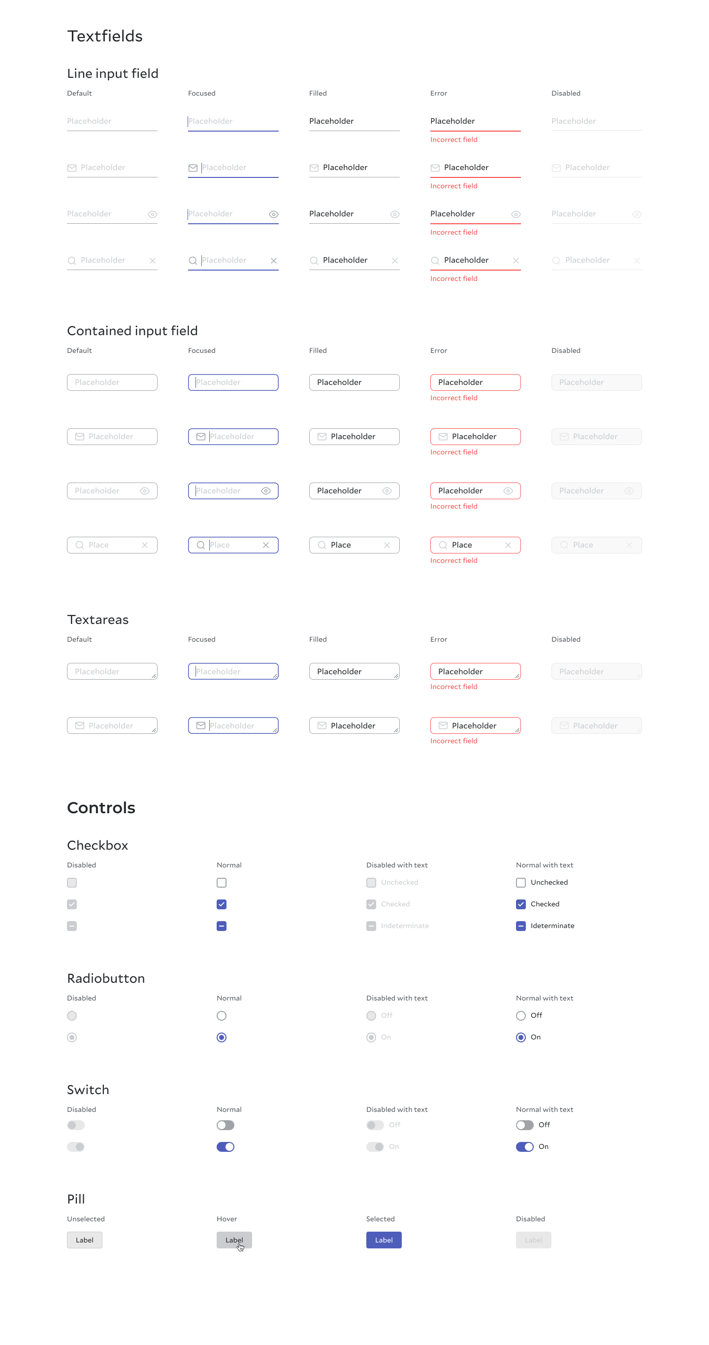
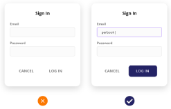
FIELDS & Forms Usage & Principal
Text fields allow users to enter text into a UI. They typically appear in forms and dialogs.
Container
Containers improve the discoverability of text fields by creating contrast between the text field and surrounding content. A text field container has a fill and containers improve the discoverability of text fields by creating contrast between the text field and surrounding content.
Fill and stroke
A text field container has a fill and a stroke (either around the entire container, or just the bottom edge). The color and thickness of a stroke can change to indicate when the text field is active.
Rounded corners
The container of an outlined text field has rounded corners, while the container of a filled text field has rounded top corners and square bottom corners.
Discoverable
Text fields should stand out and indicate that users can input information.
Clear
Text field states should be clearly differentiated from one another.
Efficient
Text fields should make it easy to understand the requested information and to address any errors.
reflections
The process of solving this issue has been a major learning ground for us. We are not experts in building design systems, not just that, we are new to UX Design and most of the principles and techniques mentioned in this case study were learned on the go. However, we experienced many challenges that allowed us to improve our soft and hard skills. Here are a few of the challenges:
1.Limitation of time and resources
2.Getting everybody on the same page and working together as a unit. Coordinating between designers, developers, and other stakeholders.
Like many things, a design system isn’t ever a finished thing — it’s a journey. How we go about that journey can affect the things we produce along the way. While we’ve learned a lot, there’s still a lot further to go. There will always be new challenges, and change is good.


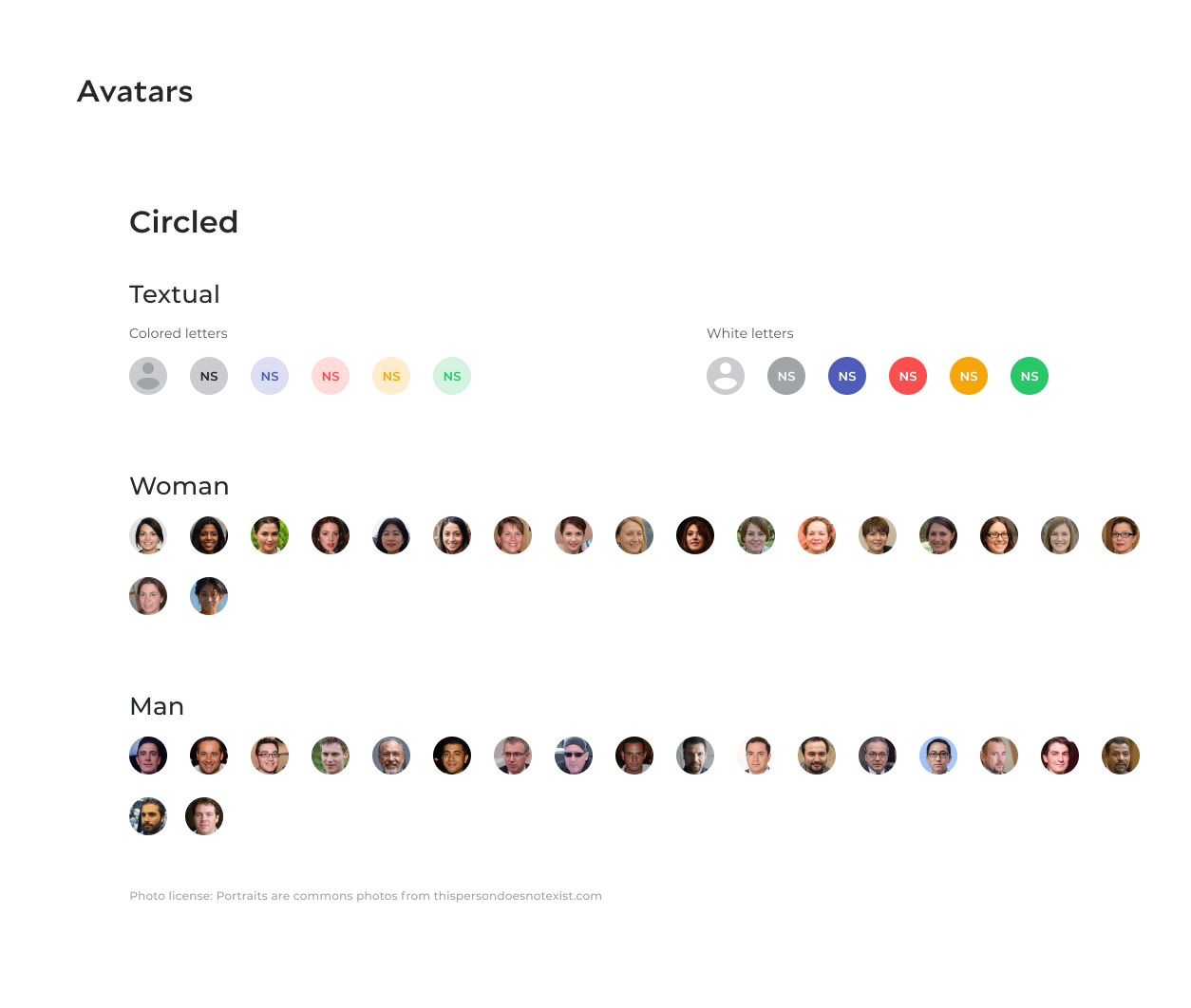